
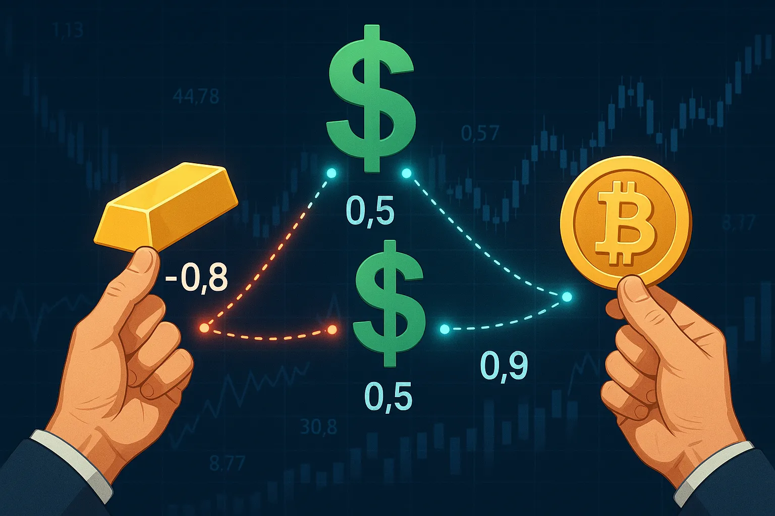
Correlation assesses the relationship between two variables, essentially showing whether they increase or decrease simultaneously. For example, in trading, a strong positive correlation between Apple and Microsoft means their price movements are generally in sync. On the other hand, assets such as the USD and Gold often demonstrate a negative correlation. Gold prices typically decline when the US dollar strengthens, and the reverse also holds true.
What will you expect in the article?
I will try to start with some basic correlation theory and move into more interesting and complex concepts using real-world data. The article will explain these concepts in detail.
- Correlation 101 theory
- Selecting some assets to use in the examples using EODHD API
- Analyse the correlation of those articles
- Discuss Rolling correlation and how to use it
- Analyse the rolling correlation of the same assets
- Discuss the VIX part on correlation
Correlation 101
Correlation is a number with decimals between -1 and 1. Closer to 1 means that there is a positive correlation, which means that when one variable increases, the other also increases. Closer to -1 is a high negative correlation, which means that when one variable increases, the other most probably decreases. When the values are close to 0, there is no correlation between the two assets.
In the investment world, correlation is most often used to:
Manage Risk and Portfolio Optimisation: helps identify how assets move together, allowing investors to avoid concentrating their exposure in one “side”. By selecting low or negatively correlated assets, the portfolio volatility and drawdowns are reduced, especially during stressful market times.
Hedging: Hedging strategies cleverly use correlation to pick assets that move in opposite directions. When you invest in negatively correlated assets, any losses on one side can be balanced out by gains on the other, providing you with even better protection against those unpredictable market shifts.
Trading Strategies: Traders utilise correlation by investing based on keeping an eye on correlation breakdowns or divergence in spotting opportunities, verifying signals, and building strong, diversified trading systems that succeed in various market conditions.
Let’s define our Asset Universe.
To make my analysis meaningful, I will select some assets that I would expect to have a positive correlation, some negative, and some with no correlation at all. I will use the EODHD API to get the asset prices.
- SP500, the “mother” of indices (SPY.US SPDR S&P 500 ETF)
- The technology sector is expected to correlate strongly with the SP500 due to its tech stock composition. (VGT.US Vanguard Information Technology Index Fund ETF Shares)
- Gold — no further introductions needed (XAUUSD.FOREX)
- Dollar index – Negative relationship with dollar (higher DXY.INDX) typically pressures gold prices, as gold becomes more expensive in other currencies
- Bonds — Bonds rise when equities fall (flight to safety). (VBTIX.US Vanguard Total Bond Market Index Fund)
- Russell 2000 (Small-Cap Stocks)- Lower correlation with SP500 than mega stocks (VTWO.US Vanguard Russell 2000 Index Fund ETF Shares)
- MSCI Emerging Markets (EM) Higher sensitivity to USD strength (EEM.US iShares MSCI Emerging Markets ETF) (inverse correlation with Dollar index)
- and finally Bitcoin (BTC-USD.CC), the “father” of crypto (o tempora o mores…)
Let’s get the prices now using EODHD API
import pandas as pd
import requests
import matplotlib.pyplot as plt
from datetime import datetime, timedelta
import seaborn as sns

api_token = '<YOUR API TOKEN>'
list_of_assets = ['SPY.US', 'VGT.US', 'XAUUSD.FOREX', 'DXY.INDX', 'VBTIX.US', 'VTWO.US', 'EEM.US', 'BTC-USD.CC']

dfs_to_concat = []

for asset in list_of_assets:
    url = f'https://eodhd.com/api/eod/{asset}'
    query = {'api_token': api_token, "fmt": "json"}
    response = requests.get(url, params=query)
    if response.status_code != 200:
        print(f"Error fetching data for {asset}: {response.status_code}")
    else:
        data_eod_history = response.json()
        df_prices = pd.DataFrame(data_eod_history)
        df_prices['date'] = pd.to_datetime(df_prices['date'])
        df_prices = df_prices.set_index('date')['adjusted_close']
        df_prices = df_prices.to_frame(name=f'{asset}')
        dfs_to_concat.append(df_prices)

df_eod_prices = pd.concat(dfs_to_concat, axis=1)

# Since we have crypto, the result will have weekends also, so we need to forward fill the dataframe with Friday's price
df_eod_prices = df_eod_prices.ffill()
# keep the x years of data
years_to_keep = 10
x_years_ago = datetime.today() - timedelta(days=years_to_keep*365)
df_eod_prices = df_eod_prices[df_eod_prices.index > x_years_ago]
df_eod_prices
At the end, we should have a dataframe (df_eod_prices) of all the assets we discussed with their daily closing prices, for the last 10 years.

Calculating correlation
With the magic of Python, the calculation of correlation is a one-liner.
A small note here. A common mistake is to calculate the correlation using the prices of stocks. There are various reasons why this is wrong, for example that the prices are on a different scale. The correct way to calculate the correlation is to do this on the daily percentage change (if you are having, of course, a daily timeframe).
Let’s calculate the correlation and plot it with a heatmap.
# create a dataframe with the daily changes of the prices
df_eod_prices_pct_changes = df_eod_prices.pct_change().dropna()

# Calculate correlations
correlation_matrix = df_eod_prices_pct_changes.corr()

# Create heatmap visualization
plt.figure(figsize=(12, 8))
sns.heatmap(correlation_matrix, annot=True, cmap='RdYlBu', center=0, cbar=True, linewidths=0.5, fmt=".2f")
plt.title("Asset Correlation Heatmap", fontsize=16)
plt.xticks(rotation=45, ha='right')
plt.yticks(rotation=0)
plt.tight_layout()
plt.show()
Let’s see if we chose our assets wisely, so we see all possible scenarios:
- SP500 and Technology sector are highly correlated (0.93) as expected, as well as with the small capitalisation ones, which is interesting
- Dollar Index does not have any strong correlation, except a negative one with Gold as expected, but -0.43 does not look quite as strong as someone would expect, and even smaller with Emerging Markets (-0.23)
- Bonds look completely uncorrelated, with a maximum correlation of 0.35 with Gold and a negative 0.30 with the Dollar Index
- Bitcoin does not seem to have any correlation, ranging from 0.23 to -0.06
Rolling Correlation
However, there is a flaw in the above calculation. We calculate the data over 10 years, assuming that the correlation is constant. But this is not true. There are periods when two assets are highly correlated and periods when they are not, or even negatively correlated. The solution is to calculate the correlation for specific periods in a rolling manner.
Pros:
- Captures time-varying relationships (e.g., stocks-bonds flipping from negative to positive correlation).
- Identifies regime shifts (e.g., crisis-driven correlation spikes).
- Enables real-time risk management by detecting weakening diversification.
- Smooths noise, highlighting persistent trends.
- Backtest strategy robustness across market cycles.
Before we move to the calculation of the rolling correlation, with some search on the internet, you can find some market practices about which window you have to monitor, depending on your trading style:
- High-frequency trading 10–30 days: Captures immediate momentum/reversal patterns
- Swing trading 30–90 days: Balances noise reduction with responsiveness to medium-term trends
- Portfolio hedging 90–180 days: Identifies regime shifts in risk relationships
- Strategic allocation 1–3 years: Aligns with business/credit cycles while mitigating short-term noise
Calculating the rolling correlation is also a one-liner in Python, as below. However, you should calculate each combination of assets since the results are a series and not a single number. So, let’s try to plot the rolling correlation between SP500 and the technology sector for a 90-day window size.
window_size = 90
asset1, asset2 = 'SPY.US', 'VGT.US'

# Calculate rolling correlation
rolling_corr = df_eod_prices_pct_changes[asset1].rolling(window=window_size).corr(df_eod_prices_pct_changes[asset2])
rolling_corr.dropna(inplace=True)

# Plot rolling correlation
plt.figure(figsize=(12, 6))
rolling_corr.plot(title=f"{window_size}-Day Rolling Correlation: {asset1} vs {asset2}")
plt.axhline(y=rolling_corr.mean(), color='r', linestyle='--', label=f"Mean Correlation ({rolling_corr.mean():.2f})")
plt.xlabel("Date")
plt.ylabel("Correlation")
plt.legend()
plt.grid()
plt.show()
You can notice that even at its lowest, the correlation was still 0.65, while there were times that reached almost the absolute 1 (0.988)
Let’s calculate the 90-day rolling correlation for all the possible combinations and show it with a boxplot.
window_size = 90
rolling_corr_df = pd.DataFrame()

correlation_long = correlation_matrix.unstack().reset_index()
correlation_long.columns = ['Asset 1', 'Asset 2', 'Correlation']
correlation_long = correlation_long[correlation_long['Asset 1'] != correlation_long['Asset 2']]
correlation_long = correlation_long.drop_duplicates(subset=['Correlation']).sort_values(by='Correlation', ascending=False)

for _, row in correlation_long.iterrows():
    asset1, asset2 = row['Asset 1'], row['Asset 2']
    rolling_corr = df_eod_prices_pct_changes[asset1].rolling(window=window_size).corr(df_eod_prices_pct_changes[asset2])
    rolling_corr_df[f"{asset1} vs {asset2}"] = rolling_corr

rolling_corr_df.dropna(inplace=True)

plt.figure(figsize=(12, 8))
sns.boxplot(data=rolling_corr_df, orient='h', palette="Set2")
plt.title(f"Boxplot of Rolling Correlations of {window_size} days, Between Asset Pairs", fontsize=16)
plt.xlabel("Correlation")
plt.ylabel("Asset Pairs")
plt.grid(axis='x', linestyle='--', alpha=0.7)
plt.tight_layout()
plt.show()
At a very high level, you can see that the correlation is not random at all, and most of the time, it respects the general norm of whether the pair is positively or negatively correlated or not at all. Before we dive into the analysis, let’s see what the above boxplots would look like if the rolling correlation were with a 10-day window.

You can see now that the outliers (values outside of the usual range) are much higher; however, most values still show the pair’s general trend.
Rolling correlation results
This is a good time now to see some interesting findings on specific pairs. Let’s look at the Dollar and Gold, which are usually negatively correlated.
window_size = 90
asset1, asset2 = 'XAUUSD.FOREX', 'DXY.INDX'

# Calculate rolling correlation
rolling_corr = df_eod_prices_pct_changes[asset1].rolling(window=window_size).corr(df_eod_prices_pct_changes[asset2])
rolling_corr.dropna(inplace=True)

# Plot rolling correlation
plt.figure(figsize=(12, 6))
rolling_corr.plot(title=f"{window_size}-Day Rolling Correlation: {asset1} vs {asset2}")
plt.axhline(y=rolling_corr.mean(), color='r', linestyle='--', label=f"Mean Correlation ({rolling_corr.mean():.2f})")
plt.xlabel("Date")
plt.ylabel("Correlation")
plt.legend()
plt.grid()
plt.show()
As you can see, the correlation generally moves negatively with spikes. Interestingly enough, the periods that it went (slightly) above zero are 2016 (Brexit), 2020 (Covid), 2022 (Russia invades Ukraine) and recently 2025 with the uncertainty of POTUS…
Changing the line of code with the two assets to Bonds and Emerging Markets
asset1, asset2 = 'VBTIX.US', 'EEM.US'
The graph is like a roller coaster:

The most significant “drawdown” is from 2016 to 2020, when the almost 0.50 positive correlation moved to a -0.60 negative one. This period was not the best for Emerging Markets assets, starting with the Fed raising interest rates seven times to strengthen the US Dollar, then 2018 Trade War I (yes, we should refer to that as One since we are at the beginning of a second one today), and ending with Covid.
Let’s check now SP vs Bitcoin. That will be interesting.
asset1, asset2 = 'SPY.US', 'BTC-USD.CC'

You can easily see that the mean correlation for the last 10 years is 0.2. However, with the naked eye, we can observe that before 2020, the mean correlation was about 0 (non-existent); after that, it was more positive. My logic says that this means that Bitcoin is treated more seriously as an investment asset incorporated in institutional portfolios. Time will only prove us wrong…
VIX, how about that one?
The VIX index (the fear and greed index) identifies when the market is stressed. Stress may be the most significant factor shifting investment choices from one asset type to another. It will be interesting to see how this plays out with the shift in correlations.
Using EODHD API , I will get VIX data, store it in a dataframe and plot it.
ticker = 'VIX.INDX'
url = f'https://eodhd.com/api/eod/{ticker}?api_token={api_token}&order=d&fmt=json'
data = requests.get(url)

if data.status_code != 200:
    print(f"Error: {data.status_code}")
    print(data.text)

data = data.json()
df_vix = pd.DataFrame(data)
df_vix = df_vix.set_index('date')
df_vix.rename(columns={'close': ticker}, inplace=True)
df_vix = df_vix[ticker]
df_vix.index = pd.to_datetime(df_vix.index)
df_vix.plot()
You can see the obvious spikes of the 2008 crisis, the 2020 COVID stressful times, and the beginning (?) of another turbulent period of today.
It will be interesting to plot VIX together with the SPY and Tech rolling correlation of a year, and see what we get.
window_size = 350
asset1, asset2 = 'SPY.US', 'VGT.US'
pair_name = f'{asset1} vs {asset2}'
rolling_corr = df_eod_prices_pct_changes[asset1].rolling(window=window_size).corr(df_eod_prices_pct_changes[asset2])
rolling_corr.index = pd.to_datetime(rolling_corr.index)

# name the column
rolling_corr.name = pair_name
df_vix_with_rolling_corr = pd.concat([df_vix, rolling_corr], axis=1).dropna()

fig, ax1 = plt.subplots()

ax2 = ax1.twinx()
ax1.plot(df_vix_with_rolling_corr.index, df_vix_with_rolling_corr['VIX.INDX'], 'g-')
ax2.plot(df_vix_with_rolling_corr.index, df_vix_with_rolling_corr[pair_name], 'b-')

ax1.set_xlabel('Time')
ax1.set_ylabel('VIX.INDX', color='g')
ax2.set_ylabel(f'{pair_name} Price', color='b')

plt.title(f'Comparing VIX.INDX and {pair_name} rolling correlation of {window_size} days')
plt.show()
The first conclusion is that when VIX goes high, correlation increases. That is because SPY and Tech are going downwards dramatically simultaneously, while in more relaxed times (like between 2017 and 2018), the low VIX makes SPY and Tech less correlated than usual.
Let’s check Gold vs Dollar:
asset1, asset2 = 'XAUUSD.FOREX', 'DXY.INDX'

Also, with the correlation, it looks like when VIX is going up, the correlation is also the same. Of course, in this case, the correlation goes from negative to even more negative, but still, this proves that VIX is a powerful index to understand when correlations are about to shift from their usual.
Food for thought
Rather than a conclusion, I would like to present some thoughts for consideration.
Limitations: Correlation analysis is based on linear conditions and assumes stable relationships, while we live in a nonlinear world. Monitoring various windows of a rolling correlation, especially in smaller windows, can give us early notice of shifts in the relationship between assets.
Causation vs. Correlation: For example, the high correlation between Bitcoin and tech stocks post-2020 doesn’t prove causation—both may simply react to Fed policy. Always ask, “What’s the underlying driver?”
VIX can help us group periods, between normal and high-stress ones so we know what to expect in terms of relationships between assets.
Scratched the surface: There are limitations in an article on how deep you can go. I believe that I just scratched the surface of an exciting concept of correlation. There are more tools and approaches that you can look for to incorporate this technique in your investing (or trading…) decisions.
Thank you for reading. I hope you enjoyed it. If you did, I suggest adding it to your lists for future reference.
You can find the jupyter notebook with the Python code here.