
You have selected the assets you would like to invest in, after spending hours analyzing data and now it is time to get into the market. Does it make sense to invest your capital using the same amount of money for each stock? Well, simply the answer is no.
Modern Portfolio Theory
Modern Portfolio Theory (MPT) by Harry Markowitz advocates diversification to manage risk and optimize returns. It suggests allocating your capital, based on risk-return profiles and correlation, aiming to reduce overall portfolio risk while maximizing potential returns. Markowitz was awarded the Nobel Prize in Economics in 1990 for this theory, which has since become a cornerstone of investment strategy, emphasizing diversification and risk management to optimize portfolio returns.
Efficient Frontier
A key tool in Modern Portfolio Theory is the Efficient Frontier, which illustrates the trade-off between risk and return in investment portfolios. It represents the set of optimal portfolios that offer the highest expected return for a given level of risk, or the lowest risk for a given level of expected return. Below is a nice video from Investopedia — with a small typo in the title from their end… 😉
https://cdn.embedly.com/widgets/media.html?src=https%3A%2F%2Fwww.youtube.com%2Fembed%2FPiXrLGMZr1g%3Ffeature%3Doembed&display_name=YouTube&url=https%3A%2F%2Fwww.youtube.com%2Fwatch%3Fv%3DPiXrLGMZr1g&image=https%3A%2F%2Fi.ytimg.com%2Fvi%2FPiXrLGMZr1g%2Fhqdefault.jpg&key=a19fcc184b9711e1b4764040d3dc5c07&type=text%2Fhtml&schema=youtube
Let’s code!
Enough with theory. Let’s see how you can get your optimal portfolio with Python.
As usual, let’s do our imports
import pandas as pd
import numpy as np
import matplotlib.pyplot as plt
from matplotlib import style
import yfinance as yf
import datetime as dt
Then we should set up our parameters. Most important is the stocks that we want to invest in. In our example, we will select Microsoft (MSFT), Amazon (AMZN), Tesla (TSLA), Banc of America (BAC), and Coca-Cola (KO). I have selected from various industries and risk profiles, so we have as many as possible not highly correlated stocks.
What would have been an investment article if it did not have the guessing part? That is what we expect the return to be for each stock. For that, I used Yahoo Finance and the estimated price of 1y that they provide and divided it by the current price as 1 — (1y target est / current price). Unfortunately, I couldn’t find in yfinance python package how to get this automatically. Feel free to comment on the article if you know another automated way (sharing is caring!).
tickers = ['MSFT', 'AMZN', 'TSLA', 'BAC', 'KO']
tickers_estimate_return = [0.1, 0.18, 0.22, 0.08, 0.11]
test_number_of_portfolios = 1000
risk_free = 0.019
timeframe = '1d'
days_of_simulation = 365
working_days_of_period = 252
end = dt.datetime.now()
start = end - dt.timedelta(days=days_of_simulation)
print(f'''Getting data from {start.strftime('%Y-%m-%d')} to {end.strftime('%Y-%m-%d')}''')
Risk-free rate is the return that an investor will gain, without any risk. The usual practice is to subtract the inflation from the US Treasury Bond. At the time of writing the article the 1 year US bond was 5.05% and the US inflation was 3.15%. This means that the risk free rate is 1.90%
Then we can get the adjusted prices of those stocks using yfinance and convert them to the daily return.
prices = yf.download(tickers, period=timeframe, start=start, end=end)['Adj Close'].pct_change()
prices.columns.name = None
prices.dropna(inplace=True)
prices = prices[tickers] #to ensure we got them in the proper order
prices.head(5)

+----------+---------+---------+---------+---------+---------+
|          |MSFT     |AMZN     |TSLA     |BAC      |CAT      |
|Date      |         |         |         |         |         |
+----------+---------+---------+---------+---------+---------+
|2023-03-21|0.005694 |0.029680 |0.078199 |0.030270 |0.020925 |
|2023-03-22|-0.005442|-0.018984|-0.032544|-0.033228|-0.022097|
|2023-03-23|0.019722 |0.000101 |0.005598 |-0.024240|-0.002319|
|2023-03-24|0.010480 |-0.005876|-0.009416|0.006303 |-0.011074|
|2023-03-27|-0.014934|-0.000917|0.007353 |0.049742 |0.004562 |
+----------+---------+---------+---------+---------+---------+
Now we should create a function that will calculate the annual estimated return, risk, and shape ratio for a specific weight and risk-free ratio.
def calc_portfolio_ratios(prices, weights, estimated_returns,risk_free):
    # estimated period returns
    estimated_period_return = np.sum(estimated_returns * weights)
    # risk (standard deviation) of portfolio
    cov_matrix = prices.cov() * working_days_of_period
    variance = weights.T.dot(cov_matrix).dot(weights)
    period_risk = np.sqrt(variance)
    # sharpe ratio
    period_sharpe_ratio = (estimated_period_return - risk_free) / period_risk
    return estimated_period_return, period_risk, period_sharpe_ratio
Using a Monte Carlo simulation, we will create 1000 random weighted portfolios and store the results of the above function in lists.
portfolio_rtn = []
portfolio_risk = []
portfolio_sharpe = []
portfolio_weights = []

# run the simulations and add the results to lists
for portfolio in range(test_number_of_portfolios):
    # create a random set of weights and sum them up to 1
    weights = np.random.random(len(tickers))
    weights /= np.sum(weights)
    portfolio_weights.append(weights)
    #calc the return, risk and sharpe
    annual_return, annual_risk, sharpe_ratio = calc_portfolio_ratios(prices, weights, tickers_estimate_return, risk_free)
    portfolio_rtn.append(annual_return)
    portfolio_risk.append(annual_risk)
    portfolio_sharpe.append(sharpe_ratio)

For a better understanding of the results, we can add to the simulations portfolios that will consist only of one stock.

for i, t in enumerate(tickers):
    weights = np.zeros(len(tickers))
    weights[i] = 1
    portfolio_weights.append(weights)
    annual_return, annual_risk, sharpe_ratio = calc_portfolio_ratios(prices, weights, tickers_estimate_return, risk_free)
    portfolio_rtn.append(annual_return)
    portfolio_risk.append(annual_risk)
    portfolio_sharpe.append(sharpe_ratio)
Following that, we will convert the simulations into a pandas dataframe
portfolio_risk = np.array(portfolio_risk)
portfolio_sharpe = np.array(portfolio_sharpe)
portfolio_return = np.array(portfolio_rtn)
portfolio_metrics = [portfolio_rtn, portfolio_risk, portfolio_sharpe]

df_portfolio_metrics = pd.DataFrame(portfolio_metrics).T
df_portfolio_metrics.columns=['Estimated Returns', 'Risk', 'Sharpe']

df_weights = pd.DataFrame(portfolio_weights)
df_weights.columns = tickers
df_simulations = df_portfolio_metrics.join(df_weights)
df_simulations.head(5)

This will get us the results:

+-+-----------------+--------+--------+--------+--------+--------+--------+--------+
| |Estimated Returns|Risk    |Sharpe  |MSFT    |AMZN    |TSLA    |BAC     |KO      |
+-+-----------------+--------+--------+--------+--------+--------+--------+--------+
|0|0.129994         |0.180888|0.613605|0.218611|0.121753|0.204237|0.293634|0.161765|
|1|0.104374         |0.173083|0.493254|0.485706|0.064478|0.057908|0.388411|0.003496|
|2|0.122598         |0.204623|0.506286|0.343321|0.027902|0.233360|0.386399|0.009019|
|3|0.130219         |0.166566|0.667718|0.258375|0.294587|0.074261|0.199563|0.173213|
|4|0.136895         |0.215162|0.547935|0.168959|0.059422|0.311878|0.329393|0.130347|
+-+-----------------+--------+--------+--------+--------+--------+--------+--------+
For example, the first portfolio to be simulated, has a return of 13%, with a risk of 0.18 and a shape ratio of 0.61 with Microsoft being 22% of our investment, Amazon 12%, Tesla 20%, Banc of America 29% and Coca-Cola 16%.
For a better visibility, we can create a separate dataframe with the simulations where we have the maximum return, minimum risk, maximum Sharpe ratio, and individual stocks. This can be done with the below piece of code:
#keep the index of the min risk, max return, max sharpe and individual stocks to be used in plot
min_risk_idx = df_simulations['Risk'].idxmin()
max_return_idx = df_simulations['Returns'].idxmax()
max_sharpe_idx = df_simulations['Sharpe'].idxmax()
tickers_idx = []
for i, t in enumerate(tickers):
tickers_idx.append(df_simulations[t].idxmax())
#create a dataframe for better visibility of the results
df_results = df_simulations.iloc[[min_risk_idx, max_return_idx, max_sharpe_idx] + tickers_idx]
df_results.insert(0, 'Description', ['Min Risk', 'Max Return', 'Max Sharpe'] + tickers)
df_results
The results are:
+----+-----------+-----------+--------+--------+--------+--------+--------+--------+--------+
| |Description|Est.Returns|Risk |Sharpe |MSFT |AMZN |TSLA |BAC |KO |
+----+-----------+-----------+--------+--------+--------+--------+--------+--------+--------+
|361 |Min Risk |0.113252 |0.116741|0.807366|0.101568|0.033010|0.060796|0.157675|0.646951|
|1002|Max Return |0.220000 |0.483333|0.415862|0.000000|0.000000|1.000000|0.000000|0.000000|
|607 |Max Sharpe |0.129604 |0.125092|0.884186|0.054415|0.215397|0.048036|0.007103|0.675050|
|1000|MSFT |0.100000 |0.223922|0.361733|1.000000|0.000000|0.000000|0.000000|0.000000|
|1001|AMZN |0.180000 |0.302707|0.531868|0.000000|1.000000|0.000000|0.000000|0.000000|
|1002|TSLA |0.220000 |0.483333|0.415862|0.000000|0.000000|1.000000|0.000000|0.000000|
|1003|BAC |0.080000 |0.252760|0.241336|0.000000|0.000000|0.000000|1.000000|0.000000|
|1004|KO |0.110000 |0.128714|0.706994|0.000000|0.000000|0.000000|0.000000|1.000000|
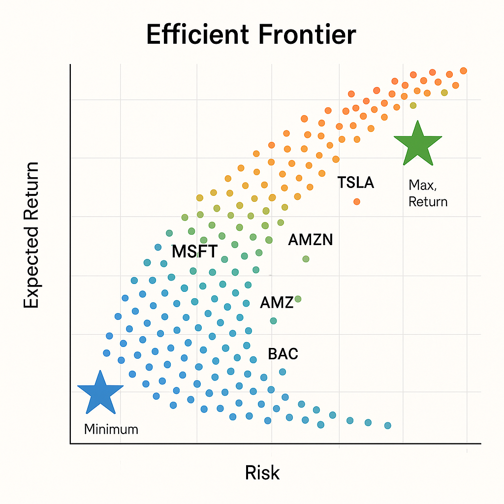
+----+-----------+-----------+--------+--------+--------+--------+--------+--------+--------+Also to have a visual representation of all the simulations, we can run the below code to get a scatter plot
plt.figure(figsize=(10, 6))
plt.scatter('Risk', 'Returns', c='Sharpe', cmap='viridis', edgecolors='k', data=df_simulations, alpha=0.7, s=50)
plt.colorbar(label = "Sharpe Ratio")
plt.xlabel('Risk')
plt.ylabel('Expected Returns')

plt.title('Portfolio Optimization Efficient Frontier')
plt.suptitle(f'From {start.strftime("%Y-%m-%d")} to {end.strftime("%Y-%m-%d")}\nNumber of portfolios = {test_number_of_portfolios}', fontsize=8)
#add a star to Max Sharpe
plt.scatter(df_simulations.iloc[max_sharpe_idx]['Risk'], df_simulations.iloc[max_sharpe_idx]['Returns'], marker='*', s=500, c='red')
#add a star to Max Return
plt.scatter(df_simulations.iloc[max_return_idx]['Risk'], df_simulations.iloc[max_return_idx]['Returns'], marker='*', s=500, c='green')
#add a star to Min Risk
plt.scatter(df_simulations.iloc[min_risk_idx]['Risk'], df_simulations.iloc[min_risk_idx]['Returns'], marker='*', s=500, c='blue')
#add the individual stocks
for i, t in enumerate(tickers):
    plt.scatter(df_simulations.iloc[tickers_idx[i]]['Risk'], df_simulations.iloc[tickers_idx[i]]['Returns'], marker='o', s=500, c='white')
    plt.scatter(df_simulations.iloc[tickers_idx[i]]['Risk'], df_simulations.iloc[tickers_idx[i]]['Returns'], marker=f'${t}$', s=500, c='red')
plt.show()
At this point, it is just a matter of your risk appetite to determine how you will allocate your funds to each stock:
- Minimum Risk (blue star): Estimated Cumulative Return will be 11% (MSFT 18%, AMZN 6%, TSLA 4%, BAC 13%, and KO 57%)
- Maximum Sharpe Ratio (red star): Estimated cumulative return will be 13% (MSFT 4%, AMZN 24%, TSLA 5%, BAC 4%, and KO 61%)
- Anywhere on the yellow part were the largest values of Sharpe Ratio are (yellow dots)
If you question why not the maximum return: well apparently the answer would be 100% of the stock that has the maximum return projected (TSLA) but I hope we agreed before that this is not what we are looking for…
Some conclusions
Based on the above lets try to understand some observations
Why Coca-Cola is the most to be invested: It has the lowest risk of all. In fact you will see in the plot that is very close to both blue and red stars
Then why not to invest 100% in Coca-cola: That is the whole point of this method. With diversification, we achieve with less risk , more return.
Why not more to Tesla since clearly it has the biggest expected return of all: Well, it also has the biggest risk of all.
You can find the above code at GiHub